Guide · Web basics · Updated August 2026
Favicons: The Small Icon That Makes Your Site Look Finished
A missing favicon is the web equivalent of an unbuttoned shirt. Here is what the icon actually does, which sizes still matter, and how to make one from your logo in five minutes.
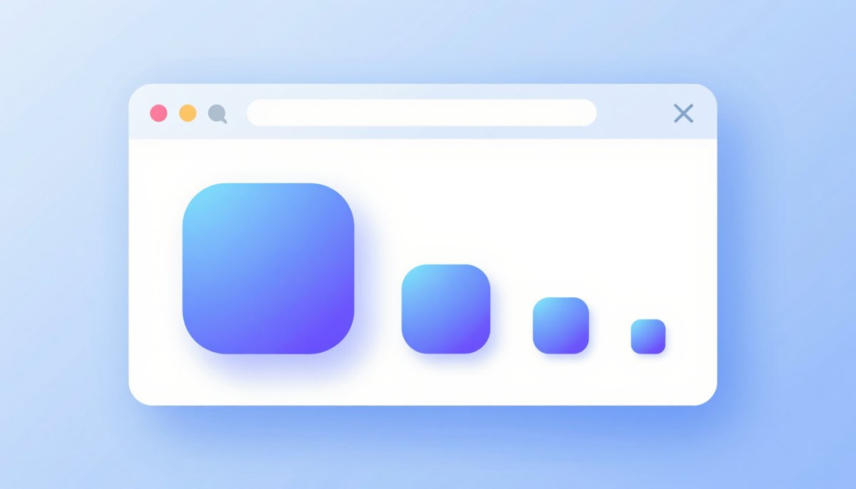
Open ten browser tabs and you navigate by icons, not titles. The sites with a crisp little mark feel established; the ones showing a generic grey globe feel abandoned. That is the whole argument for favicons in one glance — and yet a surprising number of otherwise polished sites either skip theirs or ship a version that turns invisible on dark tabs. This guide covers what a favicon does, the handful of sizes worth generating today, and the design rules that keep a logo legible at 16 pixels.
What a favicon actually does
The favicon started life as a single 16×16 icon for Internet Explorer bookmarks. Today the same small graphic works much harder:
- Tab identity — with many tabs open, browsers shrink titles down to nothing and the icon becomes the only way users find you again.
- Bookmarks and history — your icon sits next to every saved link and every history entry, quietly reinforcing the brand.
- Mobile home screens — when someone taps “Add to Home Screen” on iOS or Android, your icon becomes an app-like shortcut on their phone.
- Search results on mobile — Google shows site favicons next to results on phones. Google asks for an icon of at least 48×48 pixels for this; sites without one get a default placeholder, which visibly costs clicks against neighbours that have a real mark.
None of these placements is glamorous, but together they touch every repeat visit a user ever makes.
The sizes that matter in 2026
Favicon advice used to list fifteen-plus sizes. In practice, modern browsers scale well and you can cover everything meaningful with six small files — five PNGs plus one legacy .ico (the SVG row is a bonus, not a requirement):
| File | Size | Where it appears |
|---|---|---|
| favicon-16.png | 16×16 | Classic browser tab and bookmark size on standard displays |
| favicon-32.png | 32×32 | High-DPI tabs, taskbar and desktop shortcuts |
| apple-touch-icon.png | 180×180 | iOS and iPadOS home screen; Safari also uses it in several UI spots |
| icon-192.png / icon-512.png | 192×192 and 512×512 | Android home screen and install prompts, declared in a web app manifest |
| favicon.ico | 16 + 32 bundled | Legacy fallback — old browsers and some crawlers request /favicon.ico directly, no HTML tag needed |
| favicon.svg | Any | Modern browsers; one vector file scales perfectly and can even restyle itself for dark mode with a media query |
The SVG option is genuinely nice if your logo is already vector (see our image formats guide for where SVG fits), but it is an enhancement, not a requirement — Safari’s support has historically lagged. The PNG set above works everywhere.
Design rules for 16 pixels
Most favicon failures are design failures, not technical ones. A logo that looks great on a business card usually dies at tab size. Four rules keep it alive:
One simple shape
At 16×16 you have 256 pixels total — roughly the area of a single letter of body text. Reduce the logo to its strongest single element: the mark without the wordmark, one letter, one symbol. If your logo is a detailed illustration, draw a simplified version just for the favicon; every major brand does exactly this.
High contrast
Subtle palettes vanish at tab size. Push the contrast between your shape and its background further than feels tasteful at full size — what reads as loud at 512 pixels reads as merely visible at 16.
No text beyond one or two letters
A full word at 16 pixels is grey mush. A single bold initial works well; two letters are the practical maximum, and only if the typeface is heavy.
Test on light and dark tabs
Browsers now ship dark themes by default, so your icon will sit on both near-white and near-black tab bars. A dark navy icon disappears on a dark tab; a white icon disappears on a light one. The safest pattern is a filled shape — a coloured circle or rounded square behind your mark — so the icon carries its own background everywhere.
Making one from your logo
You do not need design software. Start from the largest, cleanest copy of your logo you have (ideally a PNG with transparency — see why PNG for logos) and prepare a square master, then use our free Image Resizer to export the sizes:
- Crop square first — in any image editor or your computer’s built-in photo viewer. Favicons are square, and this is where rectangular logos go wrong. Do not squeeze a wide logo into a square (and note that unlocking the resizer’s aspect-ratio switch stretches rather than crops) — crop to the logo’s central mark or initial instead, with a little breathing room on each side.
- Export the PNG sizes. From your square master, export 512, 192, 180, 32 and 16 pixel versions. The resizer runs entirely in your browser, so the logo never leaves your machine.
- Check the 16-pixel version at actual size. Not zoomed in — at real size, on screen. If you cannot tell what it is, simplify the shape and try again.
- Generate the .ico from the 16 and 32 pixel PNGs with any free ICO converter, and place it at the site root as
/favicon.ico.
The HTML snippet
Drop this in the <head> of every page. It covers modern browsers plus iOS; the root-level favicon.ico needs no tag at all because browsers request it automatically:
<link rel="icon" type="image/png" sizes="32x32" href="/favicon-32.png">
<link rel="icon" type="image/png" sizes="16x16" href="/favicon-16.png">
<link rel="apple-touch-icon" href="/apple-touch-icon.png">
If you also ship a web app manifest for Android, reference the 192 and 512 pixel icons there. Small files like these cost almost nothing on page weight — the icons that matter for page speed are your content images, not a 2 KB favicon.
Common mistakes
- Squeezing a rectangular logo square. The distorted result screams template site. Crop to the mark; never stretch.
- A transparent icon with dark artwork. Looks fine on your light tab bar, becomes an invisible smudge for every dark-mode user. Give the icon its own filled background.
- Forgetting the apple-touch-icon. Without the 180×180 file, iOS home-screen shortcuts fall back to a dull screenshot thumbnail of your page.
- Testing without a hard refresh. Browsers cache favicons aggressively — often for days, sometimes until the profile is cleared. After updating an icon, force-reload with
Ctrl+Shift+R(orCmd+Shift+Ron a Mac), or check in a private window. An unchanged icon after deployment is nearly always cache, not a broken tag.
The bottom line
A favicon is thirty minutes of work that pays off on every tab, bookmark, home screen and mobile search result your site ever appears in. Crop your logo square, simplify it until it survives 16 pixels, export the five sizes, add three lines of HTML — done. It is the cheapest polish your site will ever get.
Turn your logo into a favicon
Export every favicon size you need from your square master — free, right in your browser, no upload.
Open the Image Resizer